Analysing Electricity Consumption with Livebook

Back in April, I attended ElixirConf EU in Lisbon, and it was a really cool experience. But why does this matter for the blog post? José Valim opened the conference with a Keynote where he talked mostly what was the state of Elixir and also demo-ed some newish interesting things from Livebook. These had been presented during the Launch Week. (The link for the video still isn’t public, but I’ll update this when it gets published).
I had already tried out Livebook in the past, and had seen the capabilities and power of Smart Cells, mostly for Machine Learning algorithms, but I got amazed with the ease José started to transform and visualize data during the talk, using some of those “new” Smart Cells.
What are Smart Cells after all?⌗
The goal of this post is not to explain what Livebook is, and how great it is, but I feel that Smart Cells deserve at least a small reference and explanation. I may be wrong about the actual time they appeared, but I started hearing about them somewhere around this announcement, with a set of Smart Cells for Machine Learning, through Bumblebee.
In this blog post there is a great introduction to what you can achieve with them. I definitely advise you to read it, if you haven’t before.
Analysing my house’s electricity consumption/production⌗
Let’s start to dive into the goal of this blog post. As the title implies, I wanted to analyse and discover patterns in my house’s electricity consumption. Which days consumed the most electricity, and what hours do we have peak consumption? On the other side, we also have some photovoltaic panels that produce energy for direct consumption. With both metrics, I can discover a lot of interesting heuristics, for example, the best hours to power the washing machine and take direct advantage of the sunlight we get in Portugal ☀️. As we don’t have any batteries, all the exceeding production gets sold to the grid, so by keeping track of this, we can also try to estimate our final profit/loss for the whole bill.
This was something I wanted to do for some time, and I recently discovered that in Portugal you can register to e-redes. Inside the authenticated platform, it’s possible to obtain a dataset with the amount of kWh being consumed by the house/injected in the grid, every 15 minutes. (If there are some people in Portugal reading this, and also want to get this information from e-redes, note that you need to have a Smart Meter first.)
Inspecting and working with the dataset⌗
In e-redes, the dataset you can export is not a csv file, as I was expecting initially. It’s an xls with some extra information that we don’t require for this experience. So, first, we need to convert everything to a clean csv before doing any operation on top of it.
The final file has the following structure:
date,time,consumption,production
2023/05/01,13:00,0,1.948,
2023/05/01,13:15,0.06,1.896,
2023/05/01,13:30,0.172,1.132,
2023/05/01,13:45,0.088,1.504,
2023/05/01,14:00,0.036,2.204,
...
In this blog post, I’m going to only share parts of what I did in my Livebook file, and not the whole code and results. If you’re interested in the entire project, let me know and I’ll do my best to provide a version that includes randomized data.
To start a new app, you usually set up dependencies, and then the respective aliases/imports. Not all of the dependencies are directly mentioned in this blog post, and some were automatically added by the Livebook app when setting up Smart Cells.
Mix.install(
  [
    {:scholar, github: "elixir-nx/scholar"},
    {:nx, "~> 0.5.1", override: true},
    {:explorer, "~> 0.5.1"},
    {:exla, "~> 0.5.0"},
    {:vega_lite, "~> 0.1.6"},
    {:kino_vega_lite, "~> 0.1.7"},
    {:kino, "~> 0.9"},
    {:kino_explorer, "~> 0.1.4"},
    {:kino_bumblebee, "~> 0.3.0"}
  ],
  config: [nx: [default_backend: EXLA.Backend]]
)
Note: Don’t worry too much for now, about what these alias/requires represent, as they will be mentioned forward in the text.
alias VegaLite
require Explorer.DataFrame
require Explorer.Series
Nx.global_default_backend(EXLA.Backend)
So, after setting everything up it is time to read the csv files and create an Explorer.Dataframe. I won’t enter into much detail on what it is and how it works because the docs do a really good job explaining it. I recommend you to look at the Explorer documentation, also. The main thing to gather is that it serves a similar purpose to pandas DataFrame if you are familiar with Python.
In the code snippet below, I’m working with three separate csv files because the export tool only enables exporting by month. That way, I can also showcase the power of Explorer using concat_rows/1, to combine two or more data frames row-wise. (Obviously, I could build a single csv file beforehand). The part to read and load the file into a data frame, it’s easy to grasp what it does.
I only added June data when finishing the blog post, so I just copy-pasted, but one more month and I’ll refactor this into something generic. (First I want to make some benchmarks using Stream, Enum, comprehension lists, or something else, to build the final data frame.)
data_april = File.read!("2023-04.csv")
data_may = File.read!("2023-05.csv")
data_june = File.read!("2023-06.csv")

df_april = DataFrame.load_csv!(data_april)
df_may = DataFrame.load_csv!(data_may)
data_june = DataFrame.load_csv!(data_june)

df = DataFrame.concat_rows([df_april, df_may, data_june])
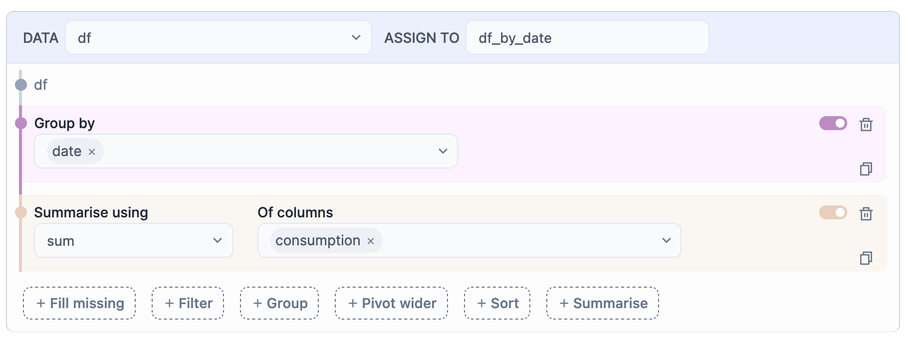
Previously, I highlighted what Smart Cells were, and how they could be helpful. This is now the part, where I got to use them. The image below shows an example of what were my first steps in analysing consumption and production values.
Just by looking at the screenshot, you can understand what’s happening. I’m using the data frame df with all the hourly values, grouping by the field date and then requesting a sum of the column consumption. In the end, the cell stores everything in a new variable called df_by_date.
The final result should look something like this:
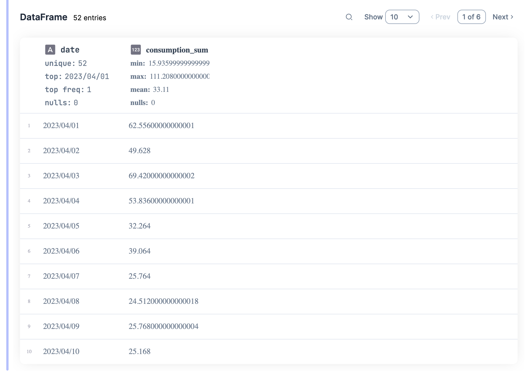
There are several more summary options, as well as different transformation combinations. This helped me a lot to get started, and after 5 minutes I already had information ready to be plotted. I’ll go into that a bit later since I need to explain something else first.
The values from consumption and production are provided in kWh (check the Wikipedia page). This means that it’s wrong to directly sum up all the values. A consumption of 1.3 kWh at 12h:30, is the amount being pulled in at that moment, and to consume 1.3kW the house would need to be at this value for a whole hour. Given we have values for every 15 minutes, the amount of kW consumed in an hour is approximately the average of those values. Here’s an example:
13:00 -> 0 kWh
13:15 -> 0.06 kWh
13:30 -> 0.172 kWh
13:45 -> 0.088 kWh

kW consumed from 13h-14h => ~ avg([0, 0.06, 0.172, 0.088]) = 0.08 kW
=> NOT sum([0, 0.06, 0.172, 0.088]) = 0.32 kW
To be able to analyse actual consumed/produced values, I converted the respective Smart Cell into code, and directly edited it. That enables us to do more complex operations than the “no-code”. With the help of DataFrame.put/4 and Series.transform/2, you can easily make extra calculations on top of existing columns to create new ones.
convert_to_hour = fn time ->
  time
  |> String.slice(0..1)
  |> String.to_integer()
end

df_per_day =
  df
  |> DataFrame.put(:hour, Series.transform(df[:time], &convert_to_hour.(&1)))
  |> DF.group_by(["date", "hour"])
  |> DF.summarise(production_mean: mean(production), consumption_mean: mean(consumption))
I eventually did other types of transformations on my data frame, but I think showing this one is enough for you to understand the idea. The process was always very similar. Now let’s dive into the pretty part, bringing in some plots.
Drawing Plots⌗
There’s also a Smart Cell to quickly visualize a data frame, and that was the path I started with again. With this type of Smart Cell you can easily draw almost any type of plot. The screenshot below shows some of those capabilities, just select the data you want to plot, the axis, type of plot and you are good to go!
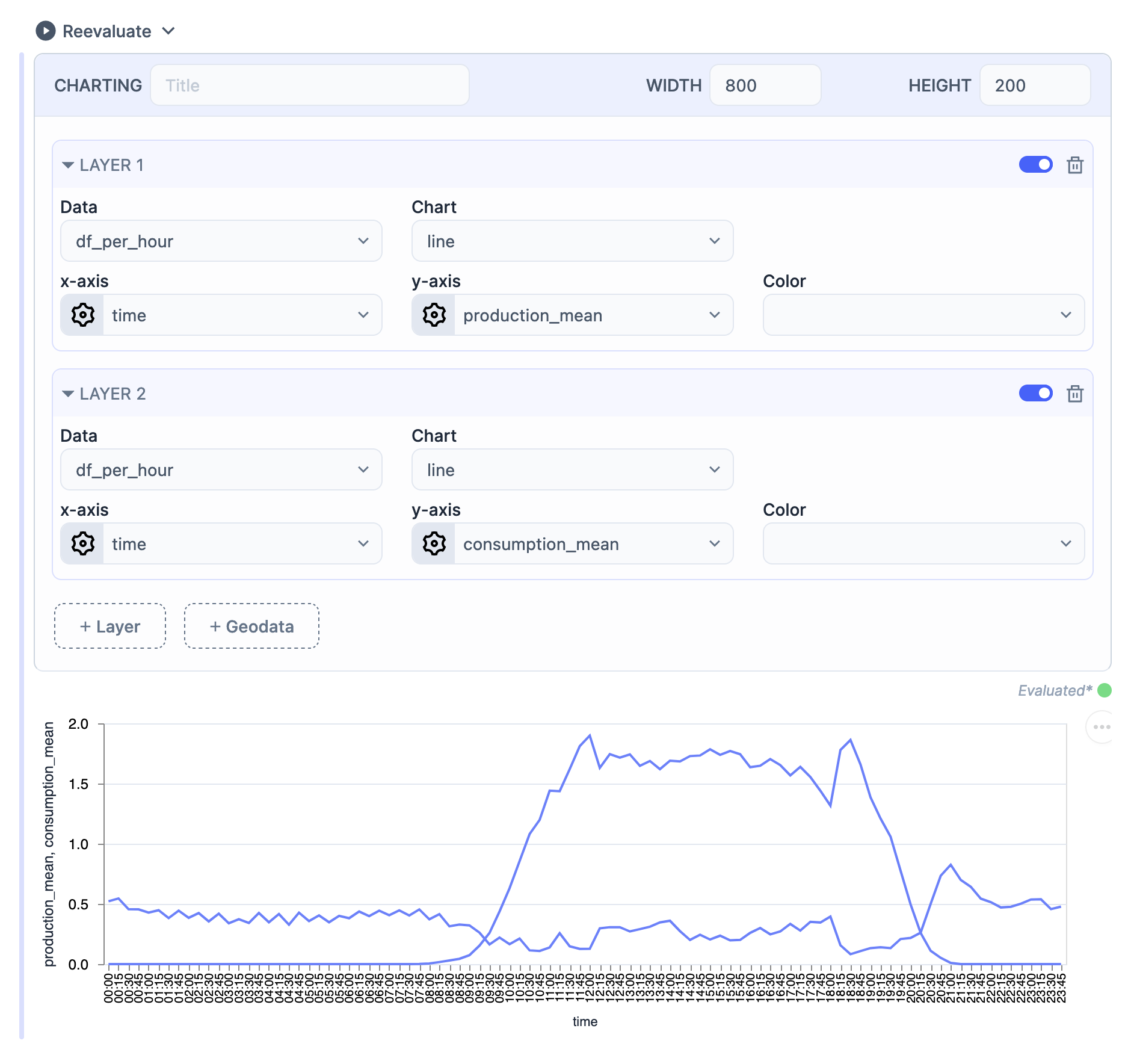
As before, to do more complex things, such as customizing the axis, labels, and colours, you need to convert this cell into Elixir code, and you can go from there with a good base.
The Hexdocs for VegaLite have some of the information on what you can customize, but if you want to go the extra mile, you’ll need to check the actual Vega-Lite docs.
Plots and Analysis⌗
Now it’s time to dive into the juicy part. Seeing the results, and getting to analyse them.
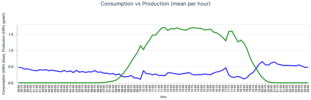
I mentioned earlier that we have the panels producing electricity for direct consumption of the house, and the rest is sold back to the grid. This is important to highlight because the values we have for consumption/production don’t account for what was consumed directly by the house. After all, the power didn’t go through the main “counter”. For the math itself, it doesn’t matter, because the values on each side cancel out, and our provider, likewise, doesn’t track that. This way, the following values don’t represent all that was consumed/produced.
- The first plot depicts the mean consumption (blue line) and the mean production (green line) per hour of the day. We can effortlessly identify the parabolic look-like function for the production, which is directly related to the Sun’s position relative to the house. There are also some spikes in both lines that we were able to map into some of our habits. Now, the goal is to move some of the higher consumption after 20h:00, to the afternoon and take advantage of the higher production values. (We sell cheaper to the grid than we buy, so it’s better for us to directly consume what we produce.)
- The fact that during the afternoon energy is being sold, but also pulled in is something that I can’t explain. At first sight, it seems that there would be enough energy to be consuming
0 kWh, but I assume this has something to do with the power required.
- The fact that during the afternoon energy is being sold, but also pulled in is something that I can’t explain. At first sight, it seems that there would be enough energy to be consuming
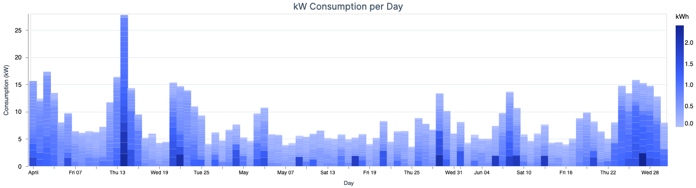
- The next plot represents a cumulative
kWhview for the consumption, per day. Each bar consists of 24 smaller blocks that represent the consumption for each hour. This plot helps us identify which days we consumed higher energy than normal, and maybe understand why.
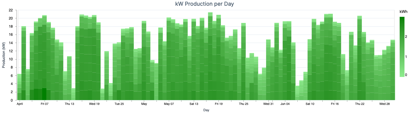
- This green one is the same as above, the difference is that it represents a cumulative view of
kWhsold back to the grid. We can’t draw many conclusions from this plot since the production amount depends a lot on weather conditions and other factors outside our reach. Still, it’s a cool thing to know.
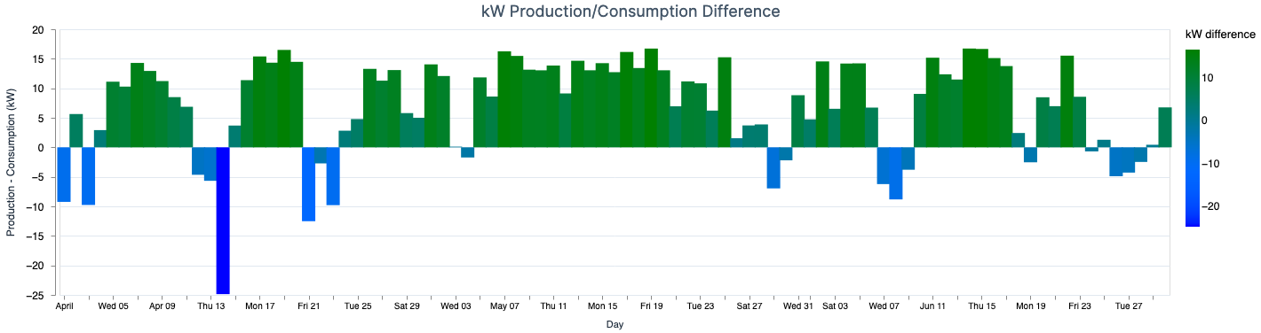
- As the title of this plot implies, it shows a daily difference between both values. This way we can see which days we consumed more than produced, and also check an overall tendency.
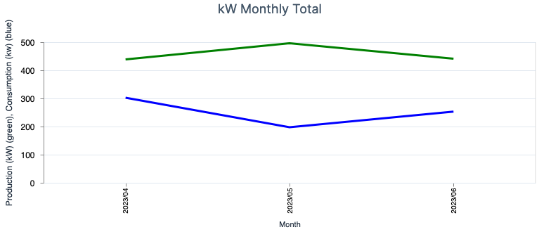
- This last one shows the difference aggregate by month. This way we can estimate how much we’ll have to pay, and how much we’ll receive by injecting the production into the grid.
Possible Next Steps⌗
This Livebook has various options that can be added in terms of complexity, which would improve the analysis process. Below there are a few potential additions and maybe I’ll write a follow-up post, in the future.
Using Scholar⌗
When I started writing this post, I was planning on doing a small intro on what Scholar is, but the legend Sean Moriarity has already done it in this great post for Dockyard blog. Be sure to read it.
By using something like Scholar I could try to use some more traditional Machine Learning algorithms to predict future consumption and production values for specific days/hours, etc. To be honest, one of the reasons I haven’t introduced it yet is because I need more data. Up until now, the days have been pretty sunny, so I don’t know know how this will behave during the winter. The other reason is that I doubt something like Linear Regression will fit the model properly, but nothing like trying it first.
Using Bumblebee or Axon⌗
Again, I could try to explain what this is all about, but Sean also has a bunch of blog posts about the topics, and no one better than himself to talk you through them. Here are some examples:
- What is Machine Learning anyway?
- Unlocking the power of Transformers with Bumblebee
- Why Should I Use Axon?
The point here is that I could use one of these tools to also make any sort of predictions for consumption/production. I expect them to perform better than just using Scholar, but again, I need to obtain more data first (maybe a full year).
Wrapping up⌗
When I started working on this, it was probably the second time I used Livebook, and since starting it, I’ve used it several times for different purposes, such as writing scripts. There are lots of things you can do with it, so you should give it a try.
On the topic of renewable energies, and helping the environment, if with this post you started considering making an investment on your own panels, then you have made my day. With favorable weather conditions in your location, then you’ll not only reduce your electricity bill, but you’ll also help the world go greener 🌱
As always, hope you have liked reading this post, and if you have any questions just reach out at one of my socials (check the footer). See you around 👋